I’ve spent seventeen years watching people struggle to sleep, and if there is one thing that drives me mad, it’s the idea that you can solve a physiological sleep crisis by simply repainting your walls a specific shade of “serene” lavender. I see people spending hundreds on designer paint because they’ve read some vague wellness blog about how bedroom colour affects mood, while they simultaneously ignore the fact that their room is a sweltering 22 degrees or that they’re scrolling on their phones until midnight. Color is a lovely thing, don’t get me wrong, but it is rarely the primary culprit when your brain refuses to shut down.
In this article, I’m not going to sell you on a magical palette of calming blues or energetic yellows. Instead, I want to draw a clear line between aesthetic preference and actual sleep hygiene. I will tell you what the science actually says about how your environment impacts your nervous system, and more importantly, I’ll help you distinguish between a room that just looks “off” and a bedroom that is actively sabotaging your rest. No hype, no expensive paint swatches—just the clinical truth.
Understanding How Bedroom Colour Affects Mood
When we talk about color psychology in interior design, we often get bogged down in the idea that a certain hue will magically trigger melatonin production. It won’t. I’ve spent seventeen years looking at polysomnograms—the actual data of your brain waves and breathing—and I can tell you that a shade of blue isn’t going to fix a sleep apnea diagnosis. However, we cannot ignore the psychological weight of our surroundings. If you are staring at a high-energy, saturated orange every night, your nervous system is receiving a signal of alertness that contradicts your goal of winding down.
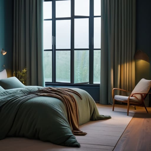
The goal isn’t to find a “magic” color, but to use soothing paint shades for relaxation to lower your baseline cortisol. This usually means leaning into warm vs cool tones for bedrooms with a preference for the latter. Cool, desaturated tones—think sage greens or dusty, muted blues—tend to create a sense of spatial calm. But remember, the color on your wall is only half the battle; the way your bedside lamp hits that pigment matters just as much. If your lighting is harsh and yellow, even the most perfect navy blue will feel oppressive rather than restful.
Key Things to Know
First, let’s get one thing straight: I am a physiologist, not an interior designer. If you come to my clinic complaining that your navy blue walls are the reason you’re waking up at 3:00 AM, I’m going to look at your caffeine intake and your screen time before I look at your paint swatches. However, I am not a Luddite; I understand that color psychology in interior design isn’t just fluff—it plays a role in how your nervous system settles at the end of the day.
When we talk about the best bedroom colors for sleep, we are really talking about reducing sensory input. High-energy hues like bright yellows or reds can keep your brain in a state of low-level alertness. Instead, you want to look at soothing paint shades for relaxation, specifically those that lean toward the cooler end of the spectrum.
The real nuance lies in the impact of lighting on color perception. A soft sage green can feel incredibly calming under a dim, warm lamp, but under a harsh, blue-toned overhead light, it can look clinical and cold. It’s about creating a cohesive, low-stimulation environment where your brain finally gets the signal that the day is actually over.
Practical Tips and Steps
If you’re planning to pick up a paintbrush, my first piece of advice is to stop overthinking the “correct” hue and start looking at your lighting. You can choose the most expensive, scientifically backed soothing paint shades for relaxation, but if your bedside lamp is a harsh, blue-toned LED, that lovely sage green will look like a sickly grey. The impact of lighting on color perception is massive; always test your samples at the specific time of day you usually wind down.
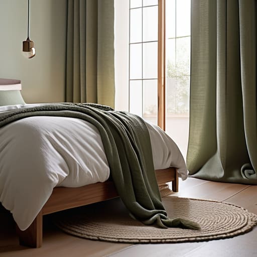
When choosing between warm vs cool tones for bedrooms, I tend to steer people toward the cooler end of the spectrum. While a warm terracotta might feel cozy during a Sunday afternoon reading session, it can subtly raise your physiological arousal when you’re trying to drop your core temperature for sleep. For most of my patients, I recommend leaning into muted, desaturated blues or soft greens. These are widely considered the best bedroom colors for sleep because they don’t demand your attention. Ultimately, you aren’t just decorating; you are creating a restful sleeping environment that signals to your nervous system that the day is officially over.
Common Mistakes to Avoid
The most common mistake I see is people getting lost in the weeds of color psychology in interior design while ignoring the physical reality of their room. You might spend a small fortune on the perfect shade of sage green, thinking it’s the silver bullet for your restlessness, only to find you’re still tossing and turning. If your bedroom is a stifling 22 degrees, no amount of “soothing paint shades for relaxation” is going to lower your core temperature enough to trigger deep sleep. Don’t mistake a cosmetic fix for a physiological solution.
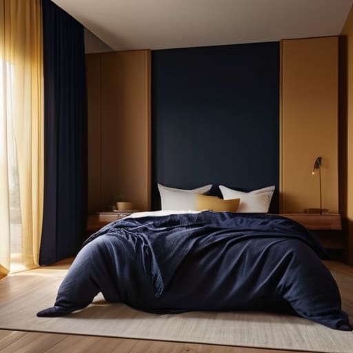
Another trap is ignoring the impact of lighting on color perception. A navy blue wall might look incredibly calming in a showroom, but under a harsh, cool-toned LED bulb, it can feel cave-like and oppressive rather than restful. People often obsess over the paint itself but forget that the light hitting that paint dictates how your brain processes the space. Before you commit to a radical redesign, look at your light sources. You aren’t just choosing a color; you are choosing how that color behaves when the sun goes down.
Final Thoughts
At the end of the day, I want you to step away from the obsession with finding the “perfect” shade of sage or navy. While understanding color psychology in interior design is helpful, it isn’t a magic wand. You could paint your walls the most scientifically proven calming hue in existence, but if you’re still scrolling through emails at midnight or keeping your thermostat at a sweltering 22 degrees, that paint won’t save your sleep. Color is a tool for setting a scene, not a cure for a disrupted circadian rhythm.
Focus on the fundamentals of creating a restful sleeping environment by treating your bedroom as a sanctuary for rest, not a multi-purpose living space. Use those soothing, muted tones to signal to your brain that the day is done, but pair them with a consistent wake time and a cool, dark room. If you fix the environment and the routine, the color becomes the finishing touch rather than a desperate attempt to fix a deeper problem. Don’t let a quest for the best bedroom colors for sleep distract you from the actual mechanics of rest.
A clinician’s guide to choosing a palette that actually works
- Stop chasing trends and look at your light levels. A dark navy wall might look sophisticated in a design magazine, but in a room with minimal natural light, it can feel oppressive and heavy, which is the last thing you want when you’re trying to wind down.
- Prioritise desaturation over brightness. It isn’t just about the hue; it’s about the intensity. A bright, energetic sky blue is very different from a muted, dusty slate. For sleep, we want the latter—colours that don’t demand your attention.
- Don’t forget the ceiling. We spend most of our time looking up when we’re struggling to drift off. If you have high-contrast or overly vibrant colours on the ceiling, your brain remains visually stimulated, making it much harder to achieve that mental quietude.
- Test your colours against your evening lighting. Most people pick a paint swatch under the harsh, cool light of a shop or midday sun, but your bedroom lives in the warm, dim glow of a lamp. That “calming sage” might look like “muddy grey” once the sun goes down.
- Use colour as a secondary tool, not a primary cure. If your bedroom is a masterpiece of soft lavender but your thermostat is set to 22 degrees and your wake-up time changes every day, the paint won’t save you. Fix the environment and the schedule first; use the colour to finish the job.
The bottom line
Don’t go down a rabbit hole of colour psychology at the expense of the basics; a calming shade won’t fix a bedroom that’s too hot or a schedule that’s a mess.
Use colour as a tool for mood regulation, not as a cure for a clinical sleep disorder—if you’re struggling, look at your light exposure and temperature first.
Your eyes might react to a bright red wall, but your brain reacts more significantly to the consistency of your environment and your wake-up time.
Frequently Asked Questions
If my bedroom walls are a dark, moody navy, does that actually count as a "dark" environment for my circadian rhythm, or is it just the lighting that matters?
It’s the lighting that matters, not the paint. I’ve spent years looking at polysomnograms where the “environment” is a sterile, brightly lit lab—the walls could be pitch black and it wouldn’t matter if the overheads were on. Your circadian rhythm responds to photons hitting your retina, not the pigment on your plaster. A navy wall won’t trick your brain into producing melatonin if you’re reading under a bright bedside lamp. Focus on the light, not the decor.
I’ve heard people say that cool colours like blue are best for sleep, but what if I find a warm, terracotta tone more relaxing than a clinical white?
Listen, if a warm terracotta makes you feel safe and settled, then use it. In my clinic, I see people obsessing over “optimal” blue tones while their bedroom is a sweltering 22 degrees. That thermal discomfort will ruin your sleep long before a warm wall does. Sleep is about psychological safety and physiological regulation. If that earthy tone helps you switch off, it’s far more effective than a “scientifically perfect” shade that feels cold and uninviting.
Does the colour of my bedding and curtains matter as much as the actual paint on the walls when it comes to my psychological state before bed?
In many ways, your bedding and curtains matter more than the paint. I see patients all the time who have a perfectly muted, sage-green room, but they’ve draped bright, neon-patterned throws over the bed. Your brain reacts to what is immediately in your visual field as you settle down. If your linens are visually “loud” or high-contrast, they can keep your nervous system on a low-level simmer when you should be winding down.