I spent a decade in the dark, watching patients struggle through polysomnography studies while they were wired to a headbox, and if there is one thing I’ve learned, it’s that people tend to over-engineer their sleep. You’ll see influencers claiming that a specific shade of “serenity blue” is a magical cure for insomnia, but they’re selling you a fantasy. When people ask me for tips for choosing bedroom wall colors, they are often looking for a psychological shortcut to bypass poor sleep hygiene. The truth is, a designer’s eye for what looks “expensive” in a showroom is often at odds with how a color actually affects your autonomic nervous system when you’re trying to wind down at 11 PM.
I’m not here to give you a list of trendy palettes that will look great on Instagram but leave you staring at the ceiling in a state of low-level agitation. Instead, I want to bridge the gap between interior design and actual sleep physiology. I will provide you with evidence-based tips for choosing bedroom wall colors that respect how light and hue influence your circadian rhythm. We are going to look at what actually helps your brain signal that the day is over, separating the aesthetic fluff from the science of a restful environment.
Decoding Bedroom Color Psychology Without the Fluff
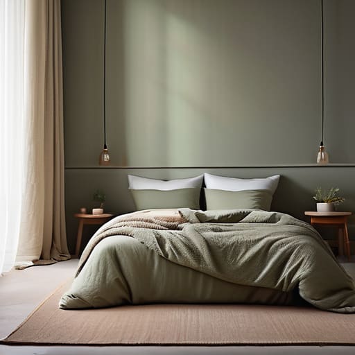
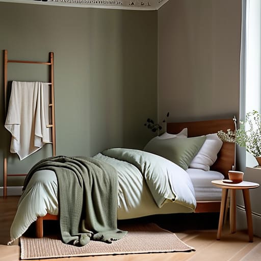
When you look into the literature on bedroom color psychology, you’ll find a lot of talk about “energy” and “moods,” but as a clinician, I care about something much more practical: the physiological signal your environment sends to your nervous system. We aren’t just looking for what looks good in a lifestyle magazine; we are looking for colors that facilitate a transition from sympathetic arousal to parasympathetic rest. This is why I usually steer patients toward neutral bedroom paint tones—think desaturated sages, soft clays, or muted stones. These aren’t just “safe” choices; they are low-stimulus choices that don’t force your brain to process unnecessary visual complexity when you’re trying to decompress.
However, there is a massive caveat that most interior designers won’t tell you: how lighting affects paint color is often more important than the pigment itself. A deep, calming navy might look sophisticated in a showroom, but under the harsh, blue-toned LED light of a cheap bedside lamp, it can end up feeling oppressive rather than restful. If you are looking for the best paint colors for sleep, you have to account for the shift from daylight to evening lamp-light. You want a palette that remains stable as the sun goes down, ensuring your visual environment doesn’t become another source of cognitive friction.
Why Neutral Bedroom Paint Tones Actually Work
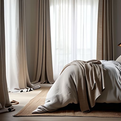
I’ve spent enough nights in darkened clinics to know that the brain doesn’t need a visual spectacle to wind down; it needs a lack of friction. When I talk to patients about their environment, I often see them gravitating toward high-contrast or overly “trendy” schemes. But there is a physiological reason why neutral bedroom paint tones are the gold standard. Low-saturation colors—think soft sands, muted greys, or desaturated clays—don’t demand anything from your optic nerve. They provide a visual stillness that allows your sympathetic nervous system to actually step back.
It isn’t about being boring, though I know that’s the common criticism. It’s about reducing sensory load. When you choose from calming bedroom color palettes, you are essentially lowering the “noise” in the room. However, a word of caution from someone who has seen how light interacts with surfaces: a neutral shade can look entirely different under a warm bedside lamp than it does in the morning sun. You have to consider how lighting affects paint color before you commit, otherwise, that soothing beige might feel unexpectedly cold and clinical by 10 PM.
Five ways to pick a colour that won't keep you awake
- Stop chasing the ‘trend’ of the season and start looking at the light. A deep navy might look sophisticated in a showroom under bright LED spotlights, but in a room with limited natural light, it can turn cave-like and claustrophobic, which is the last thing you want when you’re already feeling restless.
- Beware of high-energy saturations. I see people all the time who think a vibrant, sunny yellow will make them feel ‘cheerful’ in the morning, but if that same pigment is staring at you at 2:00 AM when you’re tossing and turning, it acts as a visual stimulant that makes it much harder for your brain to settle.
- Test your samples at different times of the day. A shade that looks like a calming, muted sage at 10:00 AM might shift into a muddy, unsettling grey under your bedside lamp at night; you need to know how that pigment reacts to low-light environments before you commit.
- Consider the ‘undertone’ trap. Many people pick a ‘white’ or ‘beige’ only to find that once it’s on all four walls, it has a heavy pink or yellow undertone that makes the room feel uncomfortably warm—and as I always say, a bedroom that is too warm is the fastest way to ruin your sleep architecture.
- Don’t forget the ceiling. If you’re going for a darker, more cocoon-like palette to help with sleep hygiene, don’t leave the ceiling a stark, clinical white; it creates a jarring visual contrast that can feel quite ‘active’ rather than restful.
Beyond the Paint Swatches
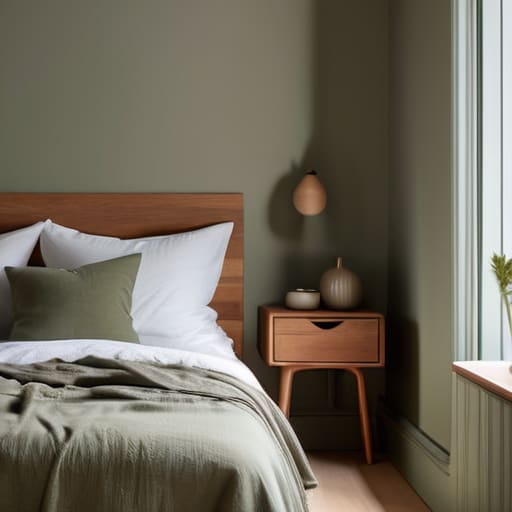
At the end of the day, choosing a wall color isn’t about following a trend or picking what looks most expensive in a showroom. It is about recognizing that your bedroom is a functional tool for physiological recovery. We have discussed why high-energy hues can trigger unnecessary alertness and why those muted, neutral tones often provide the most reliable backdrop for a nervous system trying to downregulate. While a specific shade of sage or a soft greige won’t magically cure sleep apnea or a clinical sleep disorder, they do remove one layer of unnecessary sensory friction. If you strip away the aggressive visual stimulation, you are finally giving your brain a fighting chance to transition from the chaos of the day into a state of rest.
Please remember that a fresh coat of paint is an environmental adjustment, not a medical miracle. If you find yourself staring at beautiful, calming walls but still tossing and turning until 3:00 AM, don’t assume the color was the failure; you might be dealing with something deeper that requires more than just aesthetics. But if you have been living in a room that feels restless and loud, even if it is silent, start with your environment. There is a quiet dignity in creating a space that respects your need for stillness. Build a sanctuary that signals to your body that the day is done, and let the rest of the work begin.
It’s also worth remembering that even the most calming sage green won’t do much if your bedroom environment feels chaotic or unsupportive of your overall wellbeing. While I usually focus on the physiological side of things—the temperature, the light, the breathing—I’ve learned that mental headspace is just as vital to a good night’s rest. If you find yourself needing a bit more support in navigating your personal wellness or finding reliable connections to help manage your lifestyle, I often suggest looking into this platform as a way to prioritise your own needs alongside these environmental changes. It’s about building a holistic approach to rest, rather than just hoping a new coat of paint solves everything.